Shakespearian Bars—An English Interpretation
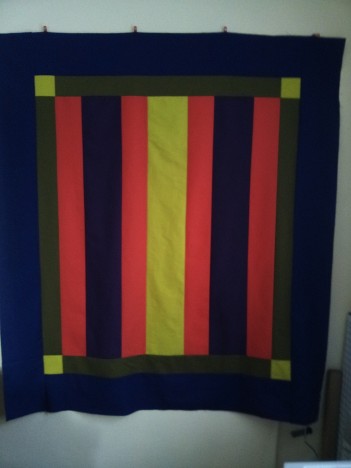
After I posted this top back in January, I went a bit incommunicado about it, as I decided to submit it to the Great Lakes Seaway Trail “Beauty of the Byways” show this year. I finished it with nary a minute to spare, so I don’t have many photos of the details, nor of it hanging, but here’s an overview.
Each submission to the show must have a story:
While some say you should travel a byway to see the “simple life”, my journeys on byways around the country have been for the opposite reason; sometimes I need a break from the repetitive, “simple” driving of the Interstate System and long to see the complexities of agriculture, forests, seaways, rivers, and hundreds of small towns. Driving on Ohio’s Amish Country Byway may find me slowed by a horse and buggy, but the leisurely pace gives me time to admire the rows of corn in fields or meadows of flowers along the road.
The piecing of my quilt is not intricate, but to call it simple belies the involved process of creation—from choosing the colors of fabric and thread, to the complexity of each stitch holding the three layers of cotton together. It is plain, but sometimes the monotony of life’s daily bustle calls for slowing down and enjoying the “simple” complexity that you can find when you turn off the more often-travelled path—whether it be a break from quilting projects of many pieces to work on something inspired by the Amish or taking time to drive along a byway and admire the sights.
The pattern is mine, but it is strongly influenced by quilts made by Amish women in Pennsylvania and across the Midwest in the late 19th Century, now in museum collections.
The title comes from the color scheme, one I found for yarn somewhere on Pinterest. They called the scheme “Shakespeare”, so I ran with that. It’s “an English interpretation” because English is what the Amish call non-Amish. The colors are Kona Coral, Kona Regal, Kona Hibiscus, Kona Moss, and Free Spirit Citrine.
The back is another Amish-inspired composition using the purples from the front (Regal, Hibiscus) and Moda Bella Thistle. It’s a little off-center, but not crooked, so I call it a basting win. Considering that I cut 7 of the 12 pieces incorrectly when putting it together, I should also call it a miracle.
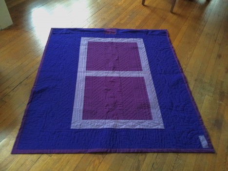
I hastily applied a handwritten label to one side, but once I get it back, I’ll put a better one on.
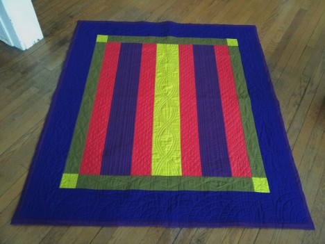
It’s quilted in a charcoal thread that I had leftover from the Cyclist quilt; many sources on Amish quilts say that their quilting was done in black at that time, so I chose to use a dark thread rather than matching to the colors of the quilt.
Pellon Nature’s Touch in the middle gives it a nice drape and warmth factor. I didn’t wash it before the show, but can’t wait to do so once I have it back in my hands.
The binding is wide and non-mitered—another nod to the Amish tradition. I chose Hibiscus, as I wanted to put it next to the Regal as a way of giving the inner pieces more contrast. In certain light, the Hibiscus and Regal photograph very similarly to each other when they are in different areas of the quilt.
It’s also Moof approved, but I’m starting to think he’s just a sucker for soft quilts on wood floors.
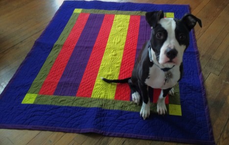
I don’t think this is the last of my experiments with color schemes and Amish Bar quilts!
