Last Look At the 1812 Quilt
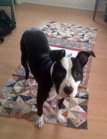
…until the show, at least—and with a bit of history to boot. I just have a small amount of work left (namely adding a hanging sleeve), then I’ll be ready to ship it off mid-February.
As I discussed many months ago, I custom designed the medallion using a stock image that I modified and had printed by Spoonflower on their linen/cotton blend fabric. I chose the image because it incorporated patriotic symbols that were just gaining importance in the late 1700s—making something that might have been sold as a commemorative piece. The linen-cotton blend is heavier than quilting cotton, but a much more interesting texture. Linen-cotton blends weren’t uncommon at the time, from what I can tell, but the medallion might not be entirely period. The imagery might be, however.
The center medallion section of the quilt was made after 1795, but before the turn of the 19th century, according to my story.
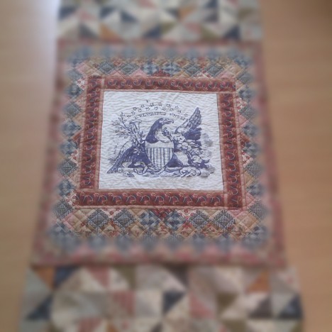
“E Pluribus Unim” (Out of many, one) and the bald eagle were adopted as part of the Seal of the US in 1782. The phrase was first used on coinage in 1795, on the $5 gold piece known as the half-eagle.
Also in 1795, a new flag was adapted with 15 stars after Vermont and Kentucky were admitted to the Union. This flag (or variants thereof) was in use until after the end of the War of 1812 (actually, until 1818).
This is why there are only 15 stars in my printed medallion, since it was intended to date to around 1795. By the time of the War’s outbreak, there were 18 states (Number 18 Louisiana was admitted in April 1812).
Finding fabrics is the hardest part of this. A design was easy enough to come up with, but even reproduction fabrics aren’t necessarily always spot-on. I’m actually not sure that any of my fabrics are even 80% accurate to the times, but it gives the right look, which is okay with me.
I took a lot of inspiration from this image that I found of scraps from a quilt thought to date between 1780–1800. I don’t know where I came across it, but if you do, please let me know so that I can give proper attribution:
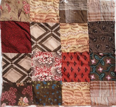
The flowers, leaves, and wheat motives are in many of the fabrics I chose.
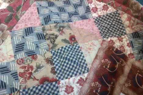
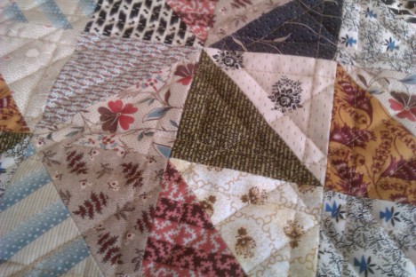
Some of the fabrics I used are modern interpretations of a general late-18th/early 19th century styles (like the two prints from French General). Others are probably pretty close to appropriate, but perhaps in colors that are more pleasing to 21st century sensibilities. Looking at some of Barbara Brackman’s blog posts about original designs and her repros, the updated colors are often obvious.
I really tried to focus on madder and indigo colors in the early part of the quilt, working toward adding more yellows in the parts that, according to the story, date to 1812. I was apprehensive about the two differently designed sections working together—even when I took the photo at the top of the page after piecing them—but after getting it all quilted and put together, I’m very pleased.
I can’t wait to see what all the other quilts are like! Are you going to the show? I hope we can meet!
Comments are closed.