Treasure Ohana
It’s becoming quite the thing for me to start off the year with a baby quilt for friends or family. This year’s is incredibly hard for me to let go of as it’s one of my favorite quilts to date, but alas, it’ll look cuter with a newborn on it.
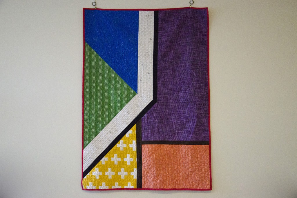
The quilt concept started with an Instagram photo by Season Evans, part of her “Concrete Quilt” series. The shapes of the pavement really stuck with me. An exhibit of Mid-century Modern prints opened up at our local museum around the same time, which further inspired me to play with the aesthetic.
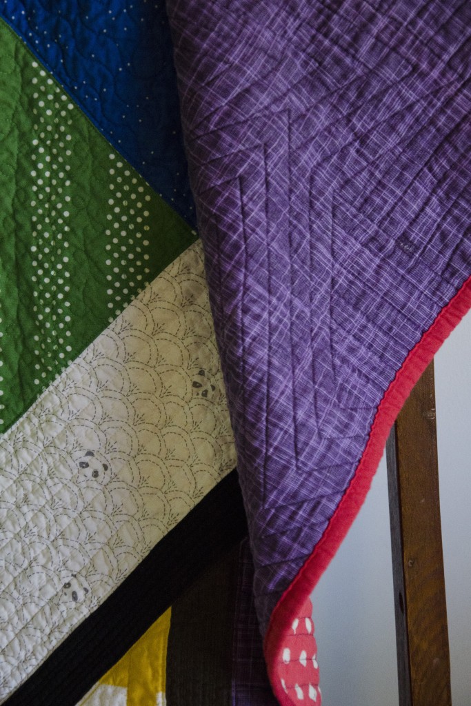
I decided to do a straight-forward representation of the different shapes and their arrangement in the photograph, but wanted to inject color and pattern to make it more kid-friendly. Since the quilt is for the daughter of one of my instructors and his wife (and fellow student), I wanted to incorporate a subtle (or not subtle) nod to our discipline into the design. Thus, the colors of the shapes are the eight colors of belts in our ranking system (in no particular order). The prints are mostly small-scale, pulled from fabric I already had. I can’t get over the cute little pandas in the white stripe.
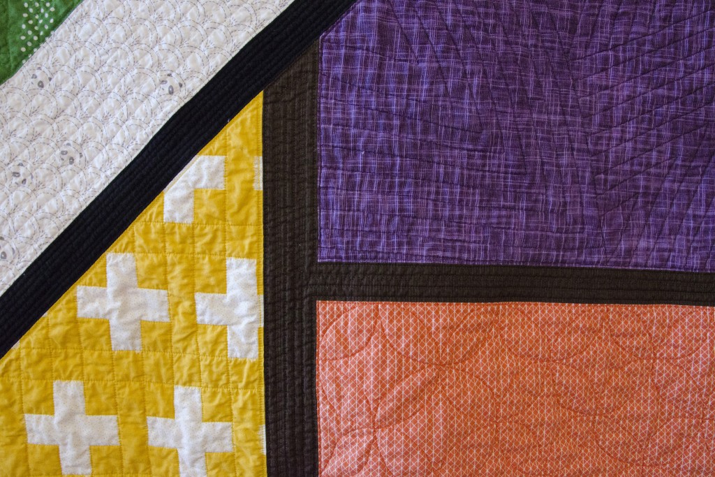
Piecing this really pushed my skills in a way I’ve shied away from in the past. I had a few rough measurements, but did a lot of the piecing improv. The central angle was nerve-wracking, but I managed it with no ripping involved, mostly by using partial seams and a lot of patience.
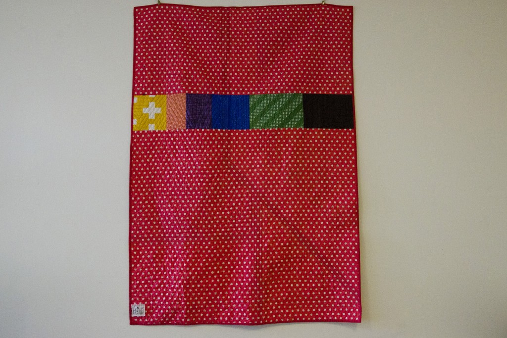
The back of the quilt is pieced from the super cute cat polkadots from Cotton+Steel and a strip of the colors from the front to give me the length needed. The quilt was just narrow enough to use the width of fabric, which limited the piecing I needed to do. The batting is Warm & Natural, as I had a crib-sized package laying around.
I also approached the quilting improvisationally, doing each section at a time with whatever spoke to me. Most of it was done with a walking foot, but the green section was free-motion quilted. There’re straight lines, loops, orange peels, zig-zags, serpentine stitches, and more. Each section was done in matching thread. The red binding echoes the belts of our experienced black belts in addition to providing a contrasting frame.
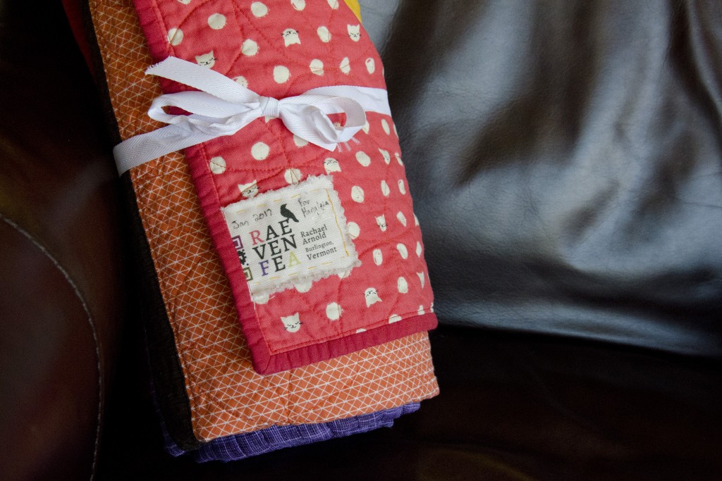
I hadn’t yet ordered new labels for the year with the appropriate year and qr code on them, so I used just the logo and name section from an old leftover. I’m beginning to think it’s time for something new, though I haven’t yet decided what I want to do going forward. For now, this one’s got the basics, and has already been delivered when our newest (just a few days-old) white belt made a surprise visit to say hello to last week’s class.
