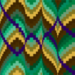
Bargello Pattern
With the color runs done for the bargello quilt, it’s time to start cutting out the strips for the quilt top. On one hand, it sounds simple: the pattern from the book tells me the widths I need for each piece… I just need to cut, right? But, in practice, the color shift across the quilt, combined with my plans to insert the purple “pop” pieces meant graphing it all out was a superb idea—and also the next step in my homework, along with starting to sew the pieces together.
Seam alignment and graphing
My teacher suggested using Microsoft Excel or a similar program to graph it all out, so I started with that, but it wasn’t lining up in a way that made sense. When cutting and piecing together your strips for Bargello, you have two basic choices: line the horizontal seams up, or stagger them. The quilt pattern I’m using is a staggered pattern (think brick laying)—so when I blocked it all out in a spreadsheet, everything was misaligned. Working from a pattern that is not staggered would have severely thrown off my piecing, since it changes the starting color of each row.
Plan two, which I should have done in the first place (considering it is what I’ve done in the past) was to open up Adobe Illustrator and block it out in that program. (Your mileage—especially if you’re not familiar with the program—may vary.)
Here’s what I came up with.


The first image has no color shifting. The second is the result straight from the instructions. Before deciding to use the pattern as-is from the book (well, prior to purple-izing it), I spent some time playing around with the color shifting as well. It’s quite simple to just swap the color of the blocks, although the color is clearly a poor substitution for the actual fabrics.
Adding the purple twist
Once I had a good graph of the color run cutting and color shifting, it was time to plan out my purple accent rows. This required a lot more playing. I knew that I wanted to do a competing curve rather than simply follow the existing ones. Ultimately, I decided on this structure:

When the curve directly mirrors the main curve, adding in my accents simply requires swapping out blocks. However, when the curve happens to correlate with the main curve, that approach will result in the purple completely taking over another color for a few blocks, which I didn’t want. This results in some trickier half-block replacements in certain rows. Having this graph to guide me is immensely useful.
If you’re interested in making a similar quilt or want to see a more detailed explanation of these modifications, you can download this pdf of my adjusted pattern complete with cutting widths.
So, at present, I’m cutting out all of my columns and inserting the color shift blocks and purple accent blocks—which requires a lot of seam ripping. There’s no solid goal for next class—just to have started piecing everything together and to bring in any questions we’ve come up with. Next time I update, I’ll be showing you progress of piecing together the rows.
What tools do you normally use to plan out your quilts (bargello or other)?
This is part three in a multi-part series. Keep following along by subscribing to the Sartorial Stitchery RSS feed, or view the related posts.


Comments are closed.